As a constant, compulsive email checker I am confronted with the Vanderbilt website and its illustrious frontpage pictures daily. Conceivably, the pictures are intended to be gently alluring, in the typical college admissions tradition of subtlety, like "VANDERBILT: WE LEARN. WE HAVE FUN. COME HERE. FUN FUN FUN." But Vanderbilt's front page excels at making one question why one goes to Vanderbilt in the first place. The front page photos are like a parade of crazy, boring, and uncomfortable.
These photos have included:
- Two nursing students administering a shot to a dummy wearing a hospital gown and staring out at the viewer with terrifyingly empty, soulless eyes.
- A, presumably, Vanderbilt student sitting in the cafeteria laughing hysterically in a manner that was vaguely autistic.
- At least a dozen classroom shots where indifferent students stare mindlessly in different directions, implying that either they have an extremely boring professor, or their prof is God and is therefore all around them.
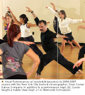
 There are so many things wrong in this picture, that I'm not really sure to begin. The Borat moustache, the barefootness, the ridiculousness of the pose, the fact that these people aren't actually synchronized but are gazing off in varying directions. These photos are not supposed to be a paen to sketchiness. I can't dwell on it much more.
Anyway, moving on to my point. In the past few days, the photos have been changed again with the traditional set of disinterested summer students, photogenic graduates, and the typical Everybody Walking Around on Campus Shot. Keeping in mind that this photo should make people want to come to Vanderbilt, I was confused by the new Everybody Walking photo:
 Wait a minute:
 So, we've got three people talking on their phones, possibly more. Not one person, out of the twenty pictured, excepting the three on their cells, is talking to another human. VANDERBILT: WE WALK IN SILENCE.
Next, we've got the girl in the black with the sunglasses on. Now, I'm sure she's lovely, charming, and a sparkling conversationalist but in this picture? She looks like a bitch. Her fists are balled and she's staring straight ahead at the camera. She's the girl, who when the girl in the white polo walks aimlessly talking on the phone, she blows by and mutters in that nasty whisper voice about paying attention to where one's going. Of course, she's centered. VANDERBILT: WE ARE BITCHES.
There's also only one guy in this photo. At first, I thought this was a problem, but upon further reflection, I realized that: any guy looking at this photo would be perflectly fine with stepping into a landscape that contains 19 girls and one other guy, even if that girl in the black would nonchalantly and coldly turn any date down. And, most girls looking at this photo, would go back to the cellphone thing. VANDERBILT: GENDER RATIOS MAY BE IN YOUR FAVOR.
Finally, we've got the caption. There's always one image in the new sets informing us all that Vanderbilt was designated a national arboretum in 1988 (a year of immense, tremendous grace). But this one has the distinction of combing the caption, with the unfocused yellow plant. The more I saw the yellow plant- which appears to be something similar to an azalea- it appeared to be some sort of yellow disease creeping out towards the students. Obviously that's not the case (...or is it?). But, once you get past that issue, you have to look at the perspective. Where is the photographer? ...In the bushes? ...Taking pictures of college aged girls? VANDERBILT: STALKERS WELCOME.


No comments:
Post a Comment